Everyone would like to see FFmpeg performance graphs based on data collected from FATE. One day, I got down to analyzing the millisecond runtime data for one configuration regarding one of the longer tests in the suite. The numbers were all over the map and directly graphing them would prove confusing and meaningless.
Then I had an idea which draws on my limited experience with digital signal processing as it pertains to multimedia. What about plotting points that represent the average of point n along with, say, points (n-15)..(n+15)? Then I refined the idea a bit– how about multiplying each point by a factor such that point n gets the most consideration while points further away from n receive progressively less consideration?
And then I quickly covered up all evidence of the brainstorm for fear of catching a beatdown from a tough gang of statisticians for devising the most idiotic idea in the history of statistics. Imagine my surprise when I was recently reading up on a completely different topic and found the exact same techniques described in practical application. It turns out they even have formal names: Moving averages, in which various forms of weighted moving averages comprise a sub-category.
This is not the first time I have re-invented something that I would later learn is called a “wheel” (the first time I can recall was when I independently figured out a bubble sort algorithm). I’m sure a spreadsheet program can be coerced to massage the data in this manner, but I decided to go the Python route; I have to use Python to effectively extract the data from MySQL into a usable form anyway.
I created a Python script that takes a list of FATE configuration IDs and a test spec number. For each configuration ID, gather the history of millisecond run times for the specified test. Run a weighted moving average using the current run time and the 9 run times prior. The current run time is multiplied by 10, (n-1) is multiplied by 9, down through (n-9) which is multiplied by 1. Divide the average by 55 (10+9+…+1). For a more elegant mathematical explanation, see the Wikipedia entry. This script allows me to dump all the performance data for a series of configurations like, for example, all of the PowerPC configurations that run on the same machine.
Then, we turn the data over to OpenOffice Calc for graphing… <sigh…>

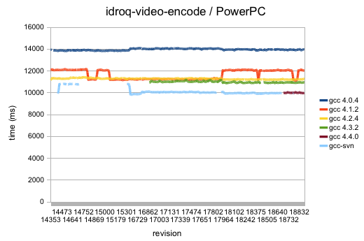
Dear OpenOffice.org: I hate you so much. Sometimes you elect to plot data on a graph in a sane range and sometimes you opt to begin from 0. The latter is shown above, where the former would have been much more appropriate. As it stands, any useful data to be gathered from the visualizing the trend of the weighted moving averages is lost. And don’t even get me started (again) on your fragility. Or your atrocious software update mechanism.
Anyway, the above graph shows performance over time for the idroq-video-encode test run on various PowerPC configurations. The graph actually does reveal at least one oddity– the orange pulse wave that represents gcc 4.1.2’s performance over time. That might be worth looking into, particularly since it’s on the high part of the wave right now.
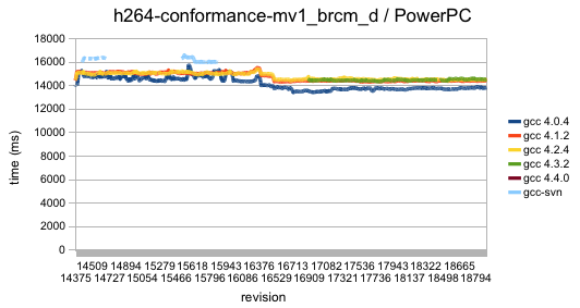
Below is the same thing, only with data collected from running h264-conformance-mv1_brcm_d which is the most computationally intensive H.264 conformance sample in the FATE suite. And it looks like I mislabeled ‘gcc 4.3.3’ as ‘gcc 4.3.2’ in both graphs. Oh well; not going through the pain of regenerating those graphs with OpenOffice now.

What to do about performance graphs going forward? I really don’t think it would be worthwhile to be able to pull graphs from the database relating to performance data over time for arbitrary tests. Most of the tests are simply too short to yield any useful trends. This would be better suited to the idea of running certain tasks less frequently. Various configurations should be made to run longevity tests on full movies encoded in various formats, once every day or 2. CPU runtime performance data (in contrast to wall clock time data) should be collected on those runs and graphed for analysis.
BTW, if anyone knows of better desktop graphing apps, do let me know. Any system, I guess. As long as it can read a CSV file and create a competent graph in a reasonable amount of time on a 2 GHz CPU, I should be able to tolerate it.