Thanks for Benjamin Larsson for advising me on how to make a proper graph using Graphviz (specify a graph of type ‘prof’ vs. ‘unix’). Thus, here are some nice (and big) graphs based on the call/ret experiment at this point:
See this post (“Refining The call/ret Monitor”) for details on how the graph data is generated.
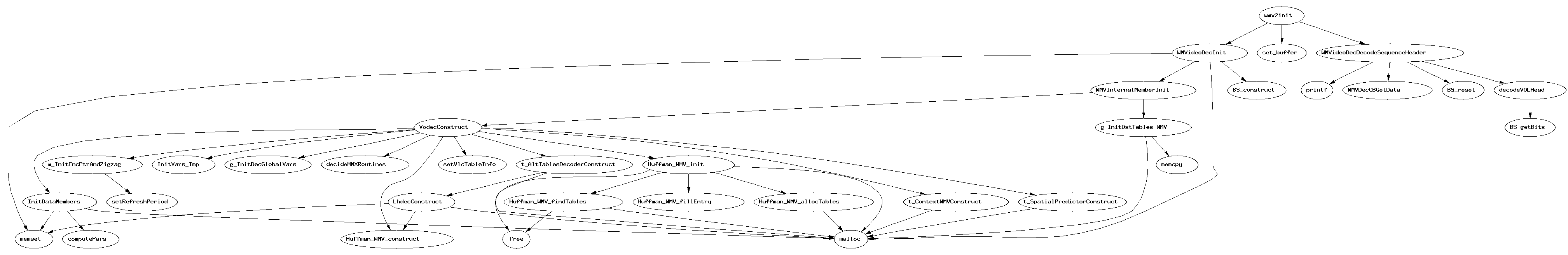
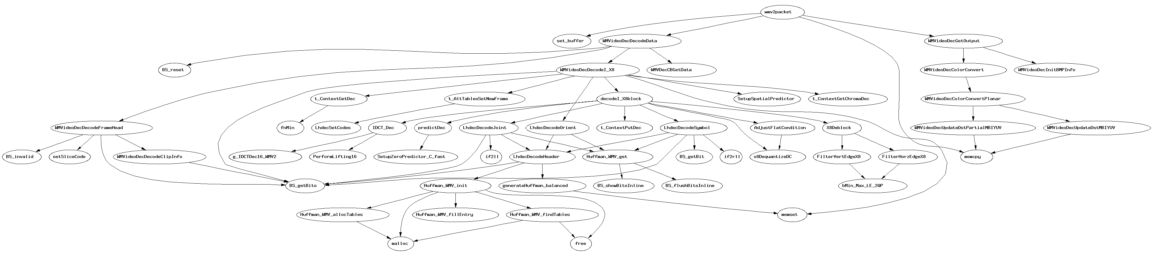
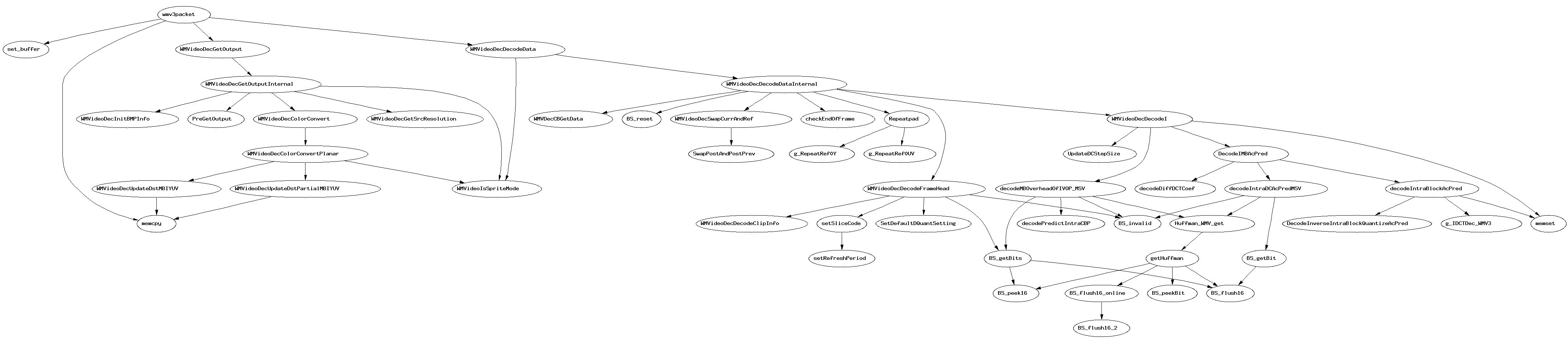
And as a bonus, I put the toolset to work analyzing Linspire’s WMV3/WMV9 decoding module. Here are some call graphs (I used the teaser trailer from Halo 2, hence the “halo2” in the filenames):
- wmv3init() callgraph; I like the way the graph expresses countless functions invoking wmvMalloc() which simply calls malloc()
- wmv3packet() frame #0 decode callgraph; note that this is just a plain, black I-frame and does not exercise a lot of the logic in the module; let’s start small