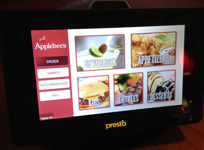
I visited an Applebee’s restaurant this past weekend. The first thing I spied was a family at a table with what looked like a 7-inch tablet. It’s not an uncommon sight. However, as I moved through the restaurant, I noticed that every single table was equipped with such a tablet. It looked like this:

For a computer nerd like me, you could probably guess that I was be far more interested in this gadget than the cuisine. The thing said “Presto” on the front and “Elacarte” on the back. Putting this together, we get the website of Elacarte, the purveyors of this restaurant tablet technology. Months after the iPad was released on 2010, I remember stories about high-end restaurants showing their wine list via iPads. This tablet goes well beyond that.
How was it? Well, confusing, mostly. The hostess told us we could order through the tablet or through her. Since we already knew what we wanted, she just manually took our order and presumably entered it into the system. So, right away, the question is: Do we order through a human or through a computer? Or a combination? Do we have to use the tablet if we don’t want to?
Hardware
When picking up the tablet, it’s hard not to notice that it is very heavy. At first, I suspected that it was deliberately weighted down as some minor attempt at an anti-theft measure. But then I remembered what I know about power budgets of phones and tablets– powering the screen accounts for much of the battery usage. I realized that this device needs to drive the screen for about 14 continuous hours each day. I.e., the weight must come from a massive battery.
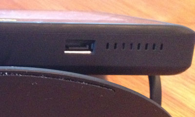
The screen is good. It’s a capacitive touchscreen, so nice and responsive. When I first spied the device, I felt certain it would be a resistive touchscreen (which is more accurately called a touch-and-press-down screen). There is an AC adapter on the side of the tablet. This is the only interface to the device:

That looks to me like an internal SATA connector (different from an eSATA connector). Foolishly, I didn’t have a SATA cable on me so I couldn’t verify.
User Interface
The interface options are: Order, Games, Neighborhood, and Pay. One big benefit of accessing the menu through the Order option is that each menu item can have a picture. For people who order more by picture than text description, this is useful. Rather, it would be, if more items had pictures. I’m not sure there were more pictures than seen in the print menu.
For Games, there were a variety of party games. The interface clearly stated that we got to play 2 free games. This implied to me that further games cost money. We tried one game briefly and the food came.
2 more options: Neighborhood– I know I dug into this option, but I forget what it was. Maybe it discussed local attractions. Finally, Pay. This thing has an integrated credit card reader. There is no integrated printer, though, so if you want one, you will have to request one from a human.
Experience
So we ordered through a human since we didn’t feel like being thrust into this new paradigm when we just wanted lunch. The staff was obviously amenable to that. However, I got a chance to ask them a lot of questions about the particulars. Apparently, they have had this system for about 5 months. It was confirmed that the tablets do, in fact, have gargantuan batteries that have to last through the restaurant’s entire business hours. Do they need to be charged every night? Yes, they do. But how? The staff described this several large charging blocks with many cables sprouting out. Reportedly, some units still don’t make it through the entire day.
When it was time to pay, I pressed the Pay button on the interface. The bill I saw had nothing in common with what we ordered (actually, it was cheaper, so perhaps I should have just accepted it). But I pointed it out to a human and they said that this happens sometimes. So they manually printed my bill. There was a dollar charge for the game that was supposed to be free. I pointed this out and they removed it. It’s minor, I know, but it’s still worth trying to work out these bugs.
One of the staff also described how a restaurant doesn’t need to employ as many people thanks to the tablet. She gave a nervous, awkward, self-conscious laugh when she said this. All I could think of was this Dilbert comic strip in which the boss realizes that his smartphone could perform certain key functions previously handled by his assistant.
Not A New Idea
Some people might think this is a totally new concept. It’s not. I was immediately reminded of my university days in Boulder, Colorado, USA, circa 1997. The local Taco Bell and Arby’s restaurants both had touchscreen ordering kiosks. Step up, interact with the (probably resistive) touchscreen, get a number, and step to the counter to change money, get your food, and probably clarify your order because there is only so much that can be handled through a touchscreen.
What I also remember is when they tore out those ordering kiosks, also circa 1997. I don’t know the exact reason. Maybe people didn’t like them. Maybe there were maintenance costs that made them not worth the hassle.
Then there are the widespread self-checkout lanes in grocery stores. Personally, I like those, though I know many don’t. However, this restaurant tablet thing hasn’t won me over yet. What’s the difference? Perhaps that automated lanes at grocery stores require zero external assistance– at least, if you do everything correctly. Personally, I work well with these lanes because I can pretty much guess the constraints of the system and I am careful not to confuse the computer in any way. Until they deploy serving droids, or at least food conveyors, there still needs to be some human interaction and I think the division between the human and computer roles is unintuitive in the restaurant case.
I don’t really care to return to the same restaurant. I’ll likely avoid any other restaurant that has these tablets. For some reason, I think I’m probably supposed to be the ideal consumer of this concept. But the idea will probably perform all right anyway. Elacarte’s website has plenty of graphs demonstrating that deploying these tablets is extremely profitable.
The only convenience I can think of, is being able to pay at the table at your own leisure and leave. On second thought, this might be nice for further order after the initial order. Like more drinks or so.
Too bad about the receipt though. You’d think they would at least be able to e-mail it to you.
Here in Sweden, we have a local hamburger restaurant chain called “Max” – which has those fast lane kiosks. They’re awesome convenient in the lunch rush.
Step in, start selecting items, confirm and pay – you’ll get a number and then you sit down or stand around the counter are and when your number comes up – you go into the express lane and pick up your order.
@Erik: To be fair, they said these things were great during the weekday lunchtime rush. The effect was lost on us during a slow Saturday lunch period.
Hi Mike and Eric,
FYI – the Presto Tablets do allow you to email your receipt. This is why it’s great when you’re in a rush to leave – swipe your card and email the receipt, without having to wait for the server.