When I was at university studying computer science, I took a basic chemistry course. During an accompanying lab, the teaching assistant chatted me up and asked about my major. He then said, “Computer science? Well, that’s just typing stuff, right?”
My impulsive retort: “Sure, and chemistry is just about mixing together liquids and coming up with different colored liquids, as seen on the cover of my high school chemistry textbook, right?”
In fact, pure computer science has precious little to do with typing (as is joked in CS circles, computer science is about computers in the same way that astronomy is about telescopes). However, people who study computer science often pursue careers as programmers, or to put it in fancier professional language, software engineers.
So, what’s a software engineer’s job? Isn’t it just typing? That’s where I’ve been going with this overly long setup. After thinking about it for long enough, I like to say that a software engineer’s trade is managing complexity.
A few years ago, I discovered Gephi, an open source tool for graph and data visualization. It looked neat but I didn’t have much use for it at the time. Recently, however, I was trying to get a better handle on a large codebase. I.e., I was trying to manage the project’s complexity. And then I thought of Gephi again.
Prior Work
One way to get a grip on a large C codebase is to instrument it for profiling and extract details from the profiler. On Linux systems, this means compiling and linking the code using the -pg flag. After running the executable, there will be a gmon.out file which is post-processed using the gprof command.
GNU software development tools have a reputation for being rather powerful and flexible, but also extremely raw. This first hit home when I was learning how to use the GNU tool for code coverage — gcov — and the way it outputs very raw data that you need to massage with other tools in order to get really useful intelligence.
And so it is with gprof output. The output gives you a list of functions sorted by the amount of processing time spent in each. Then it gives you a flattened call tree. This is arranged as “during the profiled executions, function c was called by functions a and b and called functions d, e, and f; function d was called by function c and called functions g and h”.
How can this call tree data be represented in a more instructive manner that is easier to navigate? My first impulse (and I don’t think I’m alone in this) is to convert the gprof call tree into a representation suitable for interpretation by Graphviz. Unfortunately, doing so tends to generate some enormous and unwieldy static images.
Feeding gprof Data To Gephi
I learned of Gephi a few years ago and recalled it when I developed an interest in gaining better perspective on a large base of alien C code. To understand what this codebase is doing for a particular use case, instrument it with gprof, gather execution data, and then study the code paths.
How could I feed the gprof data into Gephi? Gephi supports numerous graphing formats including an XML-based format named GEXF.
Thus, the challenge becomes converting gprof output to GEXF.
Demonstration
I have been absent from FFmpeg development for a long time, which is a pity because a lot of interesting development has occurred over the last 2-3 years after a troubling period of stagnation. I know that 2 big video codec developments have been HEVC (next in the line of MPEG codecs) and VP9 (heir to VP8’s throne). FFmpeg implements them both now.
I decided I wanted to study the code flow of VP9. So I got the latest FFmpeg code from git and built it using the options "--extra-cflags=-pg --extra-ldflags=-pg". Annoyingly, I also needed to specify "--disable-asm" because gcc complains of some register allocation snafus when compiling inline ASM in profiling mode (and this is on x86_64). No matter; ASM isn’t necessary for understanding overall code flow.
After compiling, the binary ‘ffmpeg_g’ will have symbols and be instrumented for profiling. I grabbed a sample from this VP9 test vector set and went to work.
./ffmpeg_g -i vp90-2-00-quantizer-00.webm -f null /dev/null
gprof ./ffmpeg_g > vp9decode.txt
convert-gprof-to-gexf.py vp9decode.txt > ~/bigdisk/vp9decode.gexf
Gephi loads vp9decode.gexf with no problem. Using Gephi, however, can be a bit challenging if one is not versed in any data exploration jargon. I recommend this Gephi getting starting guide in slide deck form. Here’s what the default graph looks like:
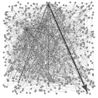
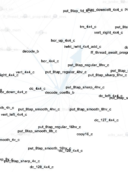
Not very pretty or helpful. BTW, that beefy arrow running from mid-top to lower-right is the call from decode_coeffs_b -> iwht_iwht_4x4_add_c. There were 18774 from the former to the latter in this execution. Right now, the edge thicknesses correlate to number of calls between the nodes, which I’m not sure is the best representation.
Following the tutorial slide deck, I at least learned how to enable the node labels (function symbols in this case) and apply a layout algorithm. The tutorial shows the force atlas layout. Here’s what the node neighborhood looks like for probing file type:
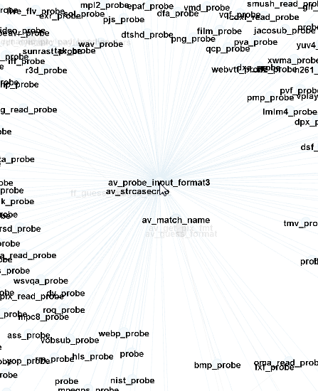
Okay, so that’s not especially surprising– avprobe_input_format3 calls all of the *_probe functions in order to automatically determine input type. Let’s find that decode_coeffs_b function and see what its neighborhood looks like:
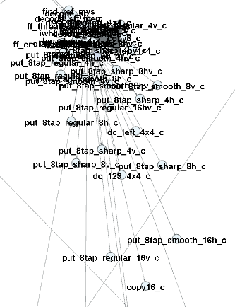
That’s not very useful. Perhaps another algorithm might help. I select the Fruchterman–Reingold algorithm instead and get a slightly more coherent representation of the decoding node neighborhood:
Further Work
Obviously, I’m just getting started with this data exploration topic. One thing I would really appreciate in such a tool is the ability to interactively travel the graph since that’s what I’m really hoping to get out of this experiment– watching the code flows.
Perhaps someone else can find better use cases for visualizing call graph data. Thus, I have published the source code for this tool at Github.
Maybe for exploration it would be more helpful if it would blink?
Or thinking of that “Linux kernel development” video many years ago, maybe animating how each node gets added when it is called and then flashes if it is called an additional time? Possibly even fading away when it has not been called a long time?
Admittedly that will be a lot of work to do, but at least it would not be a purely static image, which will contain lots of uninteresting things and might be quite misleading.
As a starting point, doesn’t gprof have some kind of “startup” option? So that you only collect profiling after all initialization is done? Alternatively, at least filter out all av_cold functions (which might also help to double-check we are using it whereever we should)?
No idea if any of these ideas have a good effort/benefit ratio though.
It would be useful to be aware of order-of-calls, that is, decode_coeffs_b and dc_4x4_c are both called from decode_b, but hor_4x4_c and dc_4x4 c are in the same “order” position, whereas decode_coeffs_b is further up in the order chain below decode_b. So you would get:
decode_b
| | |
decode_coeffs_b tm_4x4_c idct/iadst_add_4x4_c
hor_4x4_c
ver_4x4_C [etc]